Why are you afraid of color? Or why do you think you are clever with color? I have found that people who fall into these categories often have visually unsuccessful spaces. When someone is afraid of color they will be so safe that the spaces are boring and uninteresting. The fear leads to choosing white and off-white colors or very pale tones of colors.
 The other end of this spectrum are the people that think they are very clever with color and have it everywhere with no defined execution. A perfect example of this is the use of uncomplimentary colors used in adjacent spaces when they can be seen in the same view.
The solution is to choose a color palette that works for all spaces that are open to each other (spaces without doors). Successful use of color is a theme that is carried through the spaces. Use closed-off and isolated rooms as opportunities for surprise and to highlight your favorite color.
I have oversimplified the color challenge in this post. The point I make is to have an overall consistent color palette and juggle those colors through the spaces. Shy away from the lightest shade on the color card and go toward the middle or darker end. If you need inspiration, find a multi-color fabric you love and pull the color combination from that to define your color plan. Good luck!
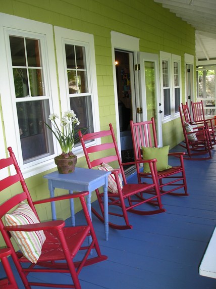
In the example below, I illustrate how I started with the color combination from the paint color fan deck and used the colors on different surfaces for a cohesive execution.